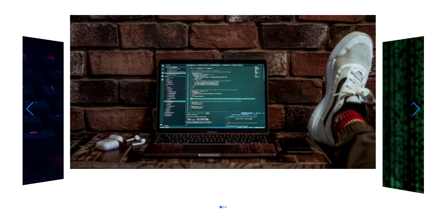
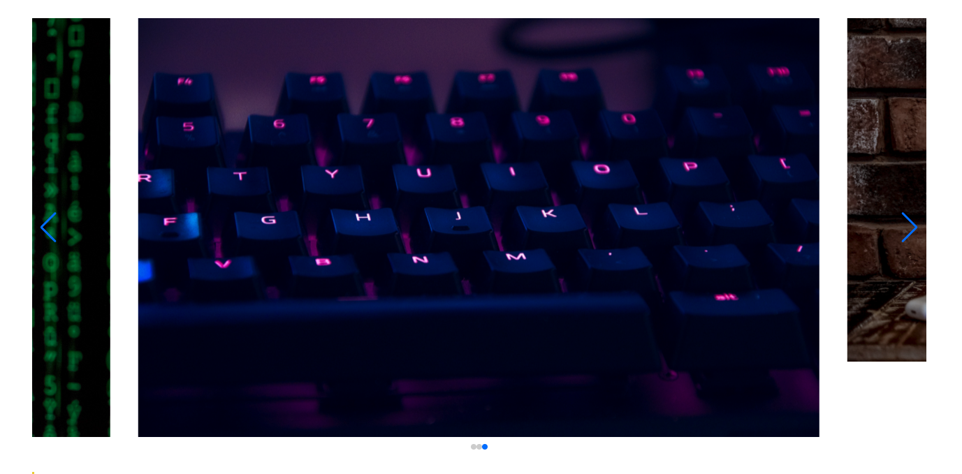
今回こんな感じのカルーセルスライダーを実装ていきます。
サクッとデモが見たい方は下記のサイトを参考にしてみてください!
スライダーを簡単に実装できるプラグイン
スライダーメニューで有名なプラグインの紹介です。
- slick(vue-slick)
slickはjQueryベースに作られた簡単にスライダーを実装できるプラグインです。
以前までは、jQueryが流行っていたので人気だった印象があります!
- swiper(vue-awesome-swiper)
slickはjQueryがベースとなっていましたが、swiperについてはJavaScriptがベースとなっています。レスポンシブにも簡単に対応できるオプションなどもあるので非常に便利です。
この2つが有名かなと思います。
今回は紹介するのは後者のswiperです、またnuxtでswiperを実装するので、vue-awesome-swiperを使って実装を進めていきます。
swiperと表記している部分については、vue-awesome-swiperのことだと基本的には考えてください。
環境とバージョンについて
- mac OS 11.2.3
- nuxt 2.15.7
- vue-awesome-swiper 4.1.1
- エディタ VSCode
- node v14.8.0
- npm 6.14.7
Nuxt swiperのインストールと設定
Nuxt swiper(vue-awesome-swiper)のインストール
  npm install swiper vue-awesome-swiper --save

  # or
  yarn add swiper vue-awesome-swiper

  # Swiper5 is recommended
  yarn add swiper@5.x vue-awesome-swiper
バージョンを指定したい場合は後ろに@バージョンをつけることで任意のバージョンをインストールすることができます。
pluginsにswiperの必要なファイルの準備
plugins/swiper.js
  import Vue from 'vue'
  import VueAwesomeSwiper from 'vue-awesome-swiper'
  import 'swiper/css/swiper.css'
  Vue.use(VueAwesomeSwiper)
nuxt.config.jsの設定
  // Plugins to run before rendering page: <https://go.nuxtjs.dev/config-plugins>
  plugins: [
    { src: '~/plugins/swiper', mode: 'client' }
  ],
nuxt.config.jsのpluginsの部分に上記を追加します。
ここまでできればあとは実際にページの作成を行います。

Nuxt swiper実装方法
まずはコンポーネントに下記のファイル(components/ui/VueSwiper.vue)を作成します。
全体のコード components/ui/VueSwiper.vue
コンポーネント内のコードを見ていきます。
  <template lang="pug">
    .main-swiper
      client-only
        swiper(:options="swiperOption")
          swiper-slide(v-for="item in items" :key="item.id")
            .s-img
              img(:src="item.img", alt="alt")
      .swiper-pagination(slot="pagination")
      .swiper-button-prev(slot="button-prev")
      .swiper-button-next(slot="button-next")
      .swiper-scrollbar(slot="swiper-scrollbar")
  </template>

  <script>
  export default {
    data() {
      return {
        items: [
          { img: '/image/main/main1.jpg' },
          { img: '/image/main/main2.jpg' },
          { img: '/image/main/main3.jpg' },
        ],
        swiperOption: {
          autoplay: {
            delay: 5000,
            disableOnInteraction: false,
          },
          slidesPerView: 1.3,
          loop: true,
          effect: 'coverflow',
          coverflowEffect: {
            rotate: 50,
            stretch: 0,
            depth: 100,
            modifier: 1,
            slideShadows: true,
          },
          speed: 1000,
          spaceBetween: 40,
          centeredSlides: true,
          pagination: {
            el: '.swiper-pagination',
            clickable: true,
            type: 'bullets',
            bulletClass: 'swiper-pagination-bullet',
          },
          navigation: {
            nextEl: '.swiper-button-next',
            prevEl: '.swiper-button-prev',
          },
          scrollbar: {
            el: '.swiper-scrollbar',
          },
        },
      }
    },
  }
  </script>

  <style lang="stylus">
  .main-swiper
    position relative
    padding 20px 0
    .s-img
      width 100%
      max-height 600px
    .swiper-pagination
      position absolute
      bottom 0
      top auto
      left 0
      right 0
      margin auto
  </style>
Html(pug)の記述
  <template lang="pug">
    .main-swiper
      client-only
        swiper(:options="swiperOption")
          swiper-slide(v-for="item in items" :key="item.id")
            .s-img
              img(:src="item.img", alt="alt")
      .swiper-pagination(slot="pagination")
      .swiper-button-prev(slot="button-prev")
      .swiper-button-next(slot="button-next")
  </template>
今回、表示する画像はv-forを使って表示させています。
  client-only
    swiper(:options="swiperOption")
      swiper-slide(v-for="item in items" :key="item.id")
        .s-img
          img(:src="item.img", alt="alt")
スライダーを表示させるのに必要な、記述は5だけになります。
あとは、ページネーションやボタンをつけるかどうかです。
- ページネーションの記述
.swiper-pagination(slot="pagination") - 次へ、戻るボタンの記述
.swiper-button-prev(slot="button-prev")
.swiper-button-next(slot="button-next")
vueの記述
 <script>
  export default {
    data() {
      return {
        items: [
          { img: '/image/main/main1.jpg' },
          { img: '/image/main/main2.jpg' },
          { img: '/image/main/main3.jpg' },
        ],
        swiperOption: {
          autoplay: {
            delay: 5000,
            disableOnInteraction: false,
          },
          slidesPerView: 1.3,
          loop: true,
          effect: 'coverflow',
          coverflowEffect: {
            rotate: 50,
            stretch: 0,
            depth: 100,
            modifier: 1,
            slideShadows: true,
          },
          speed: 1000,
          spaceBetween: 40,
          centeredSlides: true,
          pagination: {
            el: '.swiper-pagination',
            clickable: true,
            type: 'bullets',
            bulletClass: 'swiper-pagination-bullet',
          },
          navigation: {
            nextEl: '.swiper-button-next',
            prevEl: '.swiper-button-prev',
          },
          scrollbar: {
            el: '.swiper-scrollbar',
          },
        },
      }
    },
  }
  </script>
detaにswiperのオプションの設定を行っていきます。
その前に画像を繰り返し表示している部分の簡単な説明をします。
  items: [
    { img: '/image/main/main1.jpg' },
    { img: '/image/main/main2.jpg' },
    { img: '/image/main/main3.jpg' },
  ],
v-forで表示するための画像を配列で定義します。表示させたい画像がある場合は、ここにどんどん追加していけば、htmlを書き換えなくてもOKです。
v-forの記述方法がわからないって方は、記述方法の解説を行っているので、下記ページを参考にしてみてください。
nuxt v-forの使い方 dataで定義したデータを表示する方法
swiperの細かいオプションについては後ほど解説をしますので、必要最低限なオプションの説明をします。
  swiperOption: {
    autoplay: {
      delay: 5000,
      disableOnInteraction: false,
    },
    slidesPerView: 1.3,
    loop: true,
    speed: 1000,
    centeredSlides: true,
    pagination: {
      el: '.swiper-pagination',
      clickable: true,
    },
    navigation: {
      nextEl: '.swiper-button-next',
      prevEl: '.swiper-button-prev',
    },
    scrollbar: {
      el: '.swiper-scrollbar',
    },
  },
一旦このぐらいあれば問題なくスライダーの実装ができます。
Nuxt swperのオプションについて
書くオプションの解説を行って行きます。
autoplay(自動で再生させる)
  autoplay: {
    delay: 5000,
    disableOnInteraction: false,
},delayは自動で画像が変わるスピードの設定します。今回は5000ミリ秒なので5秒に一回画像が変わります。
disableOnInteractionは画像が切り替わっている途中に操作したときすぐにアクションを起こすかです。falseの場合は途中で割り込んですぐに画像が切り替わります。
loop(ループさせるか)
ループさせて表示をさせるかの設定
loop: true,slidesPerView(画像を何枚表示するか)
slidesPerView: 1.3,数値の設定をします。二枚表示させたい場合は、2と入力します。
centeredSlides(センター揃えで画像を表示)
centeredSlides: true,trueの場合、センター揃えにして表示する設定となり、falseの場合は左詰めて表示されます。
spaceBetween(画像の間隔の設定)
spaceBetween: 40,これで40px分の幅を持たせることができます。
effect(スライドするときのアニメーションの設定)
  effect: 'coverflow',
  coverflowEffect: {
    rotate: 50,
    stretch: 0,
    depth: 100,
    modifier: 1,
    slideShadows: true,
  },
effectはどの効果を使うかの指定。
coverflowEffectは今回effectでcoverflowの設定をしたので、効果の設置を行います。
効果の設定は、いろいろなものがあるので、下記の公式を参考にしてみてください!
https://swiperjs.com/swiper-api
Nuxt swiperの呼び出し方法
  <template lang="pug">
    .page-top
      vue-swiper // 追加
  </template>

  <script>
  import VueSwiper from '~/components/ui/VueSwiper.vue'
  export default {
    components : {
      VueSwiper
    },
  }
  </script>
まとめ
今回はNuxtでswiperの実装方法について紹介しました。
実装の流れは下記のような流れになります。
- Nuxt swiper(vue-awesome-swiper)のインストール
- nuxt.config.jsの設定
- pluginsにファイルを作成
- nuxt swiperのコンポーネントの作成
- 使いたいペ1ージで呼び出し
5つの流れで作成ができます。Nuxt swiperを使ってカルーセルスライダーの作り方

コメント